Wednesday, December 2, 2015

BuzzFeed vs. Diply


Both BuzzFeed and Diply are native advertising websites that connect with their followers and viewers through relatable, humorous, and interesting media via photos, memes, videos, personality quizzes, gifs, etc. 

Both BuzzFeed and Diply use Facebook, Instagram and Twitter as their main communication sources. BuzzFeed is much more established, and it is easily noted when looking at the amount of followers the have compared to Diply on each social media outlet. On Facebook, BuzzFeed boasts over 5 million "likes", while Diply has a little over 1 million. On Instagram, BuzzFeed has 1.2 million followers while Diply has 5,436. On Twitter, BuzzFeed connects with 2.7 million followers, Diply with 36.7K. 

While scrolling through BuzzFeed's feeds (pun intended), there is a large array of "news" being shared - from Starbucks' E. Coli scare, to Kim Kardashian's photoshopped photos, to Ricky Martin's endorsement of Hillary Clinton. There is such variety in the three topics mentioned above, and that is just the beginning of their never-ending news posts. BuzzFeed makes it a point to provide interesting topics to almost any type of person. The political people enjoy the articles about 2016's presidential candidates, Kardashian fans have a quick and easy way to "keep up with the Kardashians", and keeps consumers up to date on potential food scares such as Starbucks. Along with these seemingly newsworthy posts, are also humorous videos and pictures relating to college students and finals week, "Friends" fans, and other random insightful and interesting stories. 
Diply, who is very similar to BuzzFeed, seems to lack the relatability that BuzzFeed offers its followers. When scrolling through Diply's Twitter feed, there are no political news articles, no mention of newsworthy events that people want to know about - instead, there is an abundance of memes, photos, gifs, and how-to links. 

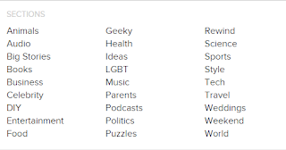
BuzzFeed also offers its followers a unique offering on Facebook that Diply does not. It not only has several sub-links to genre specific articles, but has also created separate Facebook pages sharing only on specific topics, such as BuzzFeed Travel, BuzzFeed Food, and BuzzFeed Animals. 

Whereas, while Diply has an "explore" tab on their website, it offers less variety and no social media specific pages. 

Overall, I think that BuzzFeed does a tremendous job at personalizing and customizing its news and posts to its wide array of followers. In the past 24 hours, BuzzFeed has tweeted approximately 40 times - because of their wide array of themes and topics, at least one of those posts can relate to each internet user that follows their social media accounts. That is seen through the 856 retweets BuzzFeed gets on a post vs. the 20 retweets that Diply sees. 

Because my website is BuzzFeed, I can honestly say that right now, they are doing great and are building and growing relationships daily. In the future they may need to change their methods or include more information, but right now, as long as they stay relevant and continue sharing interesting, humorous, and newsworthy posts, they will stay on top!


Monday, November 2, 2015

Affiliates: Amazon vs. eBay

Both eBay and Amazon offer a wide range of online shopping options.
One of their marketing techniques is to partner with bloggers and internet users to promote their companies. They do this via their affiliate or partnership programs.

Essentially, both Amazon and eBay offer commissions to affiliates who advertise the company name on their websites. Commissions are based on how many people use the given link to purchase an item from eBay or Amazon.


eBay uses the partner network to advertise for their partner websites. eBay offers a list of tools, widgets, and links to assist the blogger or website developer in providing the best opportunity to bring people to their site and then pushing those same viewers to eBay partner websites.
eBay offers a Creatives Generator which includes a variety of pre-made ads that can be inserted into the blog and provide an eye-catching link to eBay. The partner website describes the tools offered in great detail and sets up new partners with everything they need to succeed.


One unique thing that eBay offers is bonuses for purchases made by new (or returning) users because of the partner link on their blog. This is a great feature because it motivates partners to look for new customers, which pays up to 70% bonus to the partner, and also secures a new customer for eBay.
However, it seems that their initial website does not include advertising commissions for normal sales. That's frustrating and a deal-breaker for me as a potential partner because I don't know how much I'll be getting paid for each product purchased through my link - it's not on the main page and is not easily accessible.


Amazon provides a more interactive and informational affiliate site.
From the home page, they are advertising their commission rates and showing examples of the products their affiliates could be selling.
Amazon also offers a list of tools available to affiliates in setting up their website with quick links, banners, product links, and a unique offering of an aStore - which essentially allows the affiliate to create a customized store targeted to their audience.


They also offer a very clear advertising fee chart that allows potential affiliates to know exactly what they're going to get paid based on the products that people purchase using their links. I do not see a bonus offer for bringing in new customers, like the bonus that eBay offers. I do, however, see a volume-based advertising fee that provides an additional commission based on the volume of the products purchased.

Overall, both websites offer great opportunities for monetary gain with minimal work. They would both be great opportunities, and each offer unique tools and commissions that make each appealing. However, my heart belongs to Amazon so if I had to choose, I'd go with them. They seem to be more up-and-coming, more appealing, more organized, and overall a better brand. 

Friday, October 30, 2015

Colgate vs. Crest


Two brands that dominate the toothbrush/toothpaste market are Colgate and Crest. 
In this analysis, I decided to explore their individual websites and see who is doing best. 

Colgate's website is unique and interactive. 


Friday, October 23, 2015

Doritos v. Lays

The chip market is a large one. 
Frito-Lay owns a majority of the market, including the two most famous brands: Lays and Doritos. 
Both brands fall under the same product line and target similar demographics, have a similar price range, and are sold simultaneously in most stores. 

Through looking at both brands and their individual product lines, it is evident that Frito-Lay does a stupendous job at marketing these two brands.

Doritos Locos Tacos was introduced into the Taco Bell fast-food restaurants in 2012 and combined the Doritos market with the Taco Bell market by co-branding the two into the well-known Doritos Locos Taco, which still sells today!


Lays also saw an opportunity to reach a market that was previously non-existent or leaving as a result of the "health craze" that has been taking part in the U.S. To solve that problem, they provided a new product to their existing product line, by manufacturing baked chips - the healthier alternative. 


When  you look at the Lays website, you can see the various product lines and offerings on their homepage. They do a swell job of promoting each of their brands and making it easy for customers to search the nutritional facts or summaries of the products they offer. 


The same goes with Doritos. There's little difference between the two websites, as they are from the same owner. The Doritos website also shows the entire Doritos product line - customers can appreciate that.

All in all, I think both brands market themselves exceptionally well. I personally like Doritos better but usually avoid chips in genera, although those Baked! chips surely add a particular healthy appeal. 

Friday, October 9, 2015

Amazon vs. Ebay

I've always been a big fan of Amazon. My family has purchased from them for years, and they're my go-to for any online purchases (book buys or rentals, clothes, random items - you name it). 
One feature that I particularly like is the Amazon Prime and Student Prime programs.

The promise of knowing I will get my Prime approved purchase in two days (at no additional cost) makes my annual subscription totally worth it. Particularly when practically anything I need to purchase is accompanied by a Prime approved logo.
Not only does the Prime logo promise included 2-day shipping and free returns, but usually promises a quality product without any scams, as Ebay is notorious for. 


Friday, October 2, 2015

Apple vs. Microsoft

Apple products versus Microsoft products?
It seems like the age-old question of our generation.

Millennials grew up on Microsoft products, at least I did. But within the last 10 years, Apple has swooped in and taken a majority of the market. I mean, today, I own an iPhone, an iPad and a MacBook Air. While my mom owns a mixture of the two - an iPhone, a PC, and a Microsoft Surface Pro. 

Today, both companies recognize the importance of their online presence, but go about it in different ways. 

Apple has always differentiated itself from the rest of the electronics market. It's new, it's clean, it's modern, it's sleek - and that's exactly what their website depicts. Their home page highlights their newest products in an attractive and classy way. 


Meanwhile, the Microsoft website follows its company brand as well. Microsoft follows its colorful 4-square logo theme and Windows 8 layout throughout its website.

One thing that stood out to me was Apple's tag on their website motivating buyers to be a part of something bigger than themselves and donate to the Refugee and Migrant Crisis. I really like this incorporation to their website. 

When going to purchase an item from the Apple website, it's rather difficult to go straight and purchase the item you need because it is so focused on showcasing its products. 


Whereas the Windows website has an easily accessible "store" tab that brings its customers easily to purchase a product. 


Apple is prettier, Windows is more easily accessible. But we all know that Apple wins the electronic war, so perhaps they're on to something

Friday, September 25, 2015

Starbucks vs Dunkin' Donuts

Starbucks and Dunkin' Donuts each offer various products - one thing that they're both known for is their coffee. 

While Dunkin' primarily markets its wide array of doughnuts, bagels, and muffins, it is widely known around the world for its great coffee. 

Starbucks is widely known for its coffee, while it has been expanding its market towards sweets, snacks, and sandwiches.

Both companies are very successful in the U.S., however, how do they fair in the global market?

Dunkin' Donuts has 3,100 stores in 30 countries outside of the U.S.
Starbucks has 21,000 stores in over 65 countries outside of the U.S.

Both Starbucks and Dunkin' have realized that their marketing requires changes depending on the country and culture they are operating in.

For example, in China, Starbucks offers a Chinese website, which still follows the Starbucks brand, and the same specialty drinks, but adds a Chinese element. For example, the colorful creme-filled pastries that cannot be found in America. 


Meanwhile, Dunkin' Donuts follows a very similar path. They have a Chinese website, which offers the same coffee drinks with a highlighted emphasis on hot tea and interestingly flavored donuts. 

They do well on this aspect, knowing that their "dry pork and seaweed" donuts would never sell in the States, but obviously must appeal to their Chinese customers. 


Both Starbucks and Dunkin' Donuts do a fairly good job at global marketing. Starbucks is more widely known brand and has put the emphasis in growing globally, and therefore has been much more successful and widely accepted in over 65 countries around the world. 

Starbucks has an allure of sophistication, heightened Americanism, and relaxation. It provides a haven for its customers, especially in a country like China. It give its international customers the feeling of entering another world, another culture, another experience. Starbucks conveys these feelings even through their online website and I would say this is one of its main factors for its continued and growing success internationally. 


Friday, September 18, 2015

SAU vs. SWAU

I've decided to hit close to home for this comparison. 

Southern Adventist University or Southwestern Adventist University?

They have similar names, share the same core beliefs, and offer similar degrees.

Both have an online presence, but which University does it best?


Since the explosion of the internet and smart phones, companies in all walks of business have had to readjust their marketing strategies to continue staying relevant in our ever-changing technological world. This includes Universities.

After visiting SWAU's website both on my computer and smart phone, this is what I noticed:


1. Their mobile website is not specifically geared for mobile phones, it's the same layout as a desktop version. They have not modified their content to work with smaller screens and therefore make it more difficult to navigate by forcing the user to zoom in to be able to see links and choose links. 

2. They're using an outdated website layout to target technologically-savvy college students.

3. Specific links and informations are easy to find, both on the desktop and mobile versions, because they are all shown on the main homepage. There are less steps to find a specific action. 


Now, looking at the SAU's website, here is what I noticed:


1. Their mobile website is specifically geared for smart phones. It follows the same theme as the desktop version, but the University took the time to make it mobile-friendly. They have modified their content for small screens and users can appreciate that.

2. The layout of the website, both desktop and mobile, is fresh and modern. Their mobile page even shows the current weather. It's clean, and up-to-date with current website layouts.

3. Because of their modern layout, finding specific information is more difficult, especially on the mobile site. You must click on the "main menu" tab, which will then bring up the five main navigation tabs, and when one is clicked, then it'll show the specific links for specific actions.


Both Universities understand the importance of social networking, especially to college students, and include links to their main social media outlets on their home pages.


By looking at the home pages of both websites via desktop and mobile phone, I can see room for improvement on both ends. It'll be interesting to see improvements throughout both websites in the years to come. Will Southwestern take the time and money to update and modernize their website? Will Southern make their website more accessible and easier to navigate? 

Friday, September 11, 2015

Rock/Creek vs. REI

Rock/Creek was founded in my little hometown of Chattanooga, TN. It possesses a small, homey feel, and for 'Nooga natives, it's a right of passage.

Rock/Creek owns 4 brick and mortar locations throughout the Chattanooga area in addition to an exceptional e-commerce website that was voted 2009 Retailer of the Year for Online Business by Backpacker Magazine.

Their tangible stores are clean, organized, and exude the "outdoorsy yet sophisticated" feel that Chattanooga emanates. The Rock/Creek e-commerce website successfully provides the same experience.


Because it only services the Chattanooga, TN area, it is not as widely known as other outdoor outfitter's like REI. However, due to its online presence, it is now able to target a market beyond SE Tennessee.

Rock/Creek is geographically segmented towards the inhabitants of Chattanooga and its surrounding area. It also has a psychographic segmentation for consumers who are adventurous, and who actively enjoy the outdoors through various avenues.

It holds the competitive advantage in Chattanooga because of its roots in the area. Chattanooga is a "buy local" kind of city, that supports its local businesses as much as possible. Therefore, Rock/Creek has done rather well for itself.


Tuesday, September 1, 2015

Priceline vs. Hotwire

We all love a good deal, and that is precisely what Priceline aimed to offer when it started its company in 1998. 

Now, the makers of Priceline were smart. They saw a market no one had tapped into: online travel booking. And they booked it to success. 
Priceline held the market for a number of years, even through the steep plummet from 2001-2009. Hotwire, a worthy competitor jumped in the running in 2000. 

Both companies offer relatively the same products--discount flights, hotels, and rental cars. 

However, each company has taken a unique approach at branding themselves, differentiating their products in, well, different ways. 

When you go to Priceline.com, you see William Shatner and Kaley Cuoco. Most customers are sure to recognize at least one of them--Shatner is well known for his role as Captain Kirk in StarTrek and has been the face of Priceline since its early beginnings. Cuoco is well known to Millennials from her role as Penny in the hit sitcom The Big Bang Theory. 

Priceline has created a whole story-line using these two characters. They've taken their customers beyond a simple online shopping experience, to shopping with the "Negotiator" and his newly revealed "secret" daughter. Purchasing a flight to San Fransisco suddenly becomes a humorous family affair. 

The website is fun, bright, easy to navigate, and follows the Negotiator's story all the way through to checkout. As a hotel search loads, Shatner appears in a silly "Negotiating" pose, promising to find the greatest hotel deals--and he usually does!

There is continuity and purpose in Priceline's marketing. They've created a brand presence that leaves targeted audiences unable to separate Captain Kirk and Penny from great online travel deals. 

Hotwire alternatively chooses to go a more professional route, creating a clean, straightforward approach for its customers. It does not have a clear brand presence besides the bright red dot in the logo. Honestly, it's not exciting or eye-catching. In fact, it's rather bland.  

Not only does the Hotwire home webpage have three "get the app" advertisements...on the same screen...


...it also slightly resembles a busy magazine advertisement page with cheesy photos of tourist attractions in different cities advertising its hotel deals. Displaying all the information necessary except the name of the hotels. 
What? Where are the hotel names you ask? Yes, that's right. Not there. One major differentiating factor between Priceline and Hotwire, is that when you book hotels through Hotwire, you don't know exactly what hotel you're booking with. That doesn't sit well with every customer, who will simply turn to another travel site that gives them the information they need. 

Perhaps this limited information offering is a marketing tactic for their customers to follow their Twitter banner quote:

While we're on the subject of social media, after minutes of scouring the Hotwire website (which is already a bad sign), there is no mention of links to their social media websites. However, they obviously do exist--as shown above. 

Whereas, Priceline has clear availability to their wide social media presence at the bottom of their homepage. 

In addition, Priceline's Twitter webpage follows their brand theme of blue accent colors and a banner photo of the "Negotiator" and his daughter.


It is also worth mentioning that Priceline has 4x the amount of followers as Hotwire. Priceline also tweets relative and interactive links and photos. For example, they play a continuous game of "Can  you guess where he's staying?"

Meanwhile, Hotwire fails to provide new content on their feed, instead, simply retweeting "praise tweets" from followers/customers. Which is not bad. But also not good enough. 


To me, Priceline seems like the clear winner in accomplishing great e-marketing and brand presence. Both offer great deals in unique ways and Hotwire may very-well win in respect to value--but loses because of its poor marketing strategy. Understandably, Hotwire wants to differentiate itself from its competitors, however, there is a clear reason for why Priceline is the leader in online travel. Hotwire would do well to reflect on its brand and find a more definite direction, target audience, and purpose to attract customers to its products.